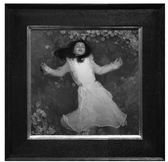
Getting to know and understand NOTAN, a Japanese term that translates to light/dark harmony in the work, will help you add another dimension to your compositions.
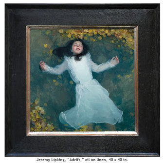
One of my favorite painters, Jeremy Lipking uses Notan to reinforce the effect of this painting:
Images and palette information via oilcolorpalettes.blogspot.com
In this example above, Notan (contrast of light and dark) works subtly to help draw our eye to the focal point and then dances us around the space by the way of the light trim on the girls dress.
Jeremy Lipking’s oil color palette:
- Mixture: Ultramarine Blue, Titanium White, Alizarin Crimson (med value, cool blue for cooling colors)
- Titanium White
- Cadmium Lemon
- Cadmium Yellow
- Cadmium Orange
- Cadmium Red
- Alizarin Crimson Permanent
- Burnt Sienna
- Ultramarine Blue
- Cobalt
- Golden Green
- Viridian
- Ivory Black
Source: Clifton Phachanla
Interested in purchasing these oil colors? Visit Blick Art Materials.
